My role
- • UX/UI Designer
- • Researcher
- • UX Writer
Tools
- • Figma
- • FigJam
- • Midjourney
- • Confluence
- • Mixpanel
- • Miro
- • Teams
Goals
The main goal of the onboarding improvement was to increase the conversion rate of beauty service providers completing the onboarding process. Before the redesign, the conversion rate was only 36%, and we aimed to raise it to at least 66%. Additional goals included improving the user experience by addressing issues like confusing performance of components, unclear messaging, and motivation problems that caused many users to drop off during the onboarding.
Problem statement
The existing onboarding had several issues: a high drop-off rate, confusion during basic data entry, unclear UX writing, outdated design, and technical problems. Based on user feedback, analytics, and usability testing, I hypothesized that a more visually appealing, motivating, and well-written onboarding flow would reduce drop-offs and increase profile completions.
Solution
- Version A: A shorter onboarding that encouraged quick completion, with additional details filled out later via reminders.
- Version B: A longer onboarding for a complete profile upfront, with no additional steps afterward.
Design process
The strong previous conversion rate was 25% during 3 months, with 48% of users dropping off at the first step, not entering basic data.

Mixpanel Onboarding flow funnel.

My draft remarks on the initial onboarding design.
- Analytics: I reviewed data such as drop-off rates to pinpoint specific issues.
- Benchmarking: I examined other successful onboarding processes in the industry to gather ideas for improvement.
- Interviews & Usability Tests: I interviewed and tested 7 service providers to identify pain points and areas for improvement.


Selected applications on the basis of which I did benchmarking.
- Onboarding was too complicated and difficult to follow, with unclear instructions.
- Lack of motivation: Users felt overwhelmed and confused, leading to a high drop-off rate.
Solution:
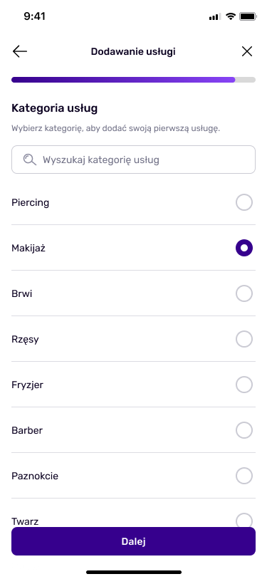
Removed the massive header to prevent overwhelming users, added a progress bar to encourage active completion, simplified on-screen content through UX writing to help users quickly understand how a specific functionality works, introduced a close x-mark button to give users full control in line with Nielsen Norman's 10 usability heuristics, and split the flow into more screens with less information to reduce the feeling of having too many tasks at once.
Original

Improved
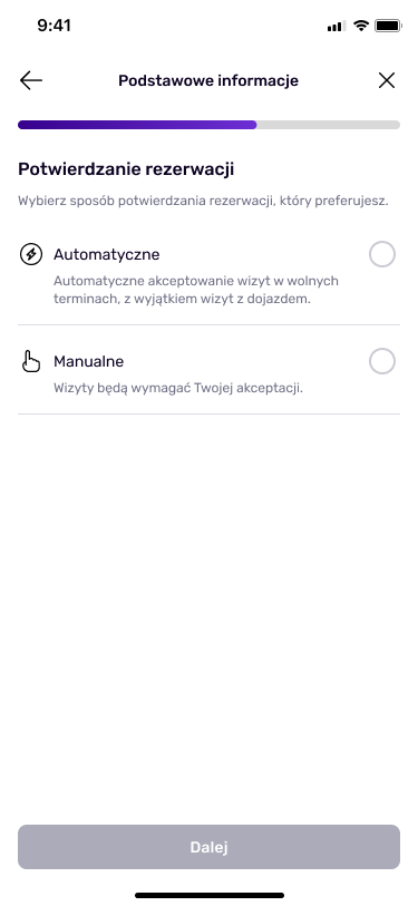
- A shorter and more visually appealing onboarding would increase the completion rate
- A longer onboarding process would ensure users set up a complete profile, which could lead to better engagement later.
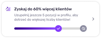
A banner encouraging the completion of the second part of onboarding.
- Increase the conversion rate to at least 66%.
- Reduce drop-offs by addressing the pain points and improving UX writing.
Original
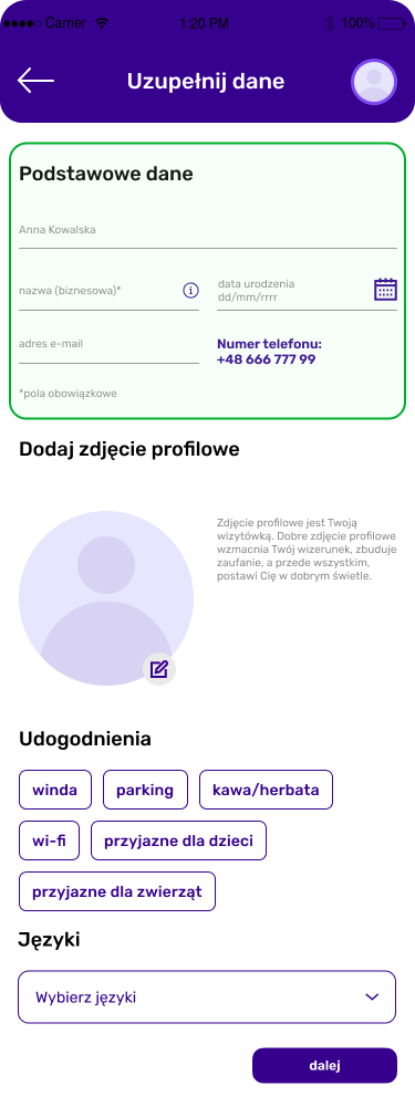
Improved
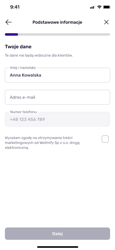
Original
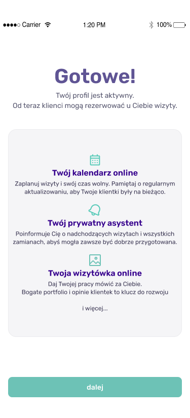
Improved
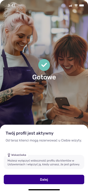
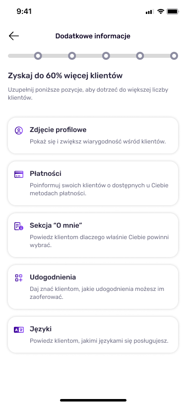
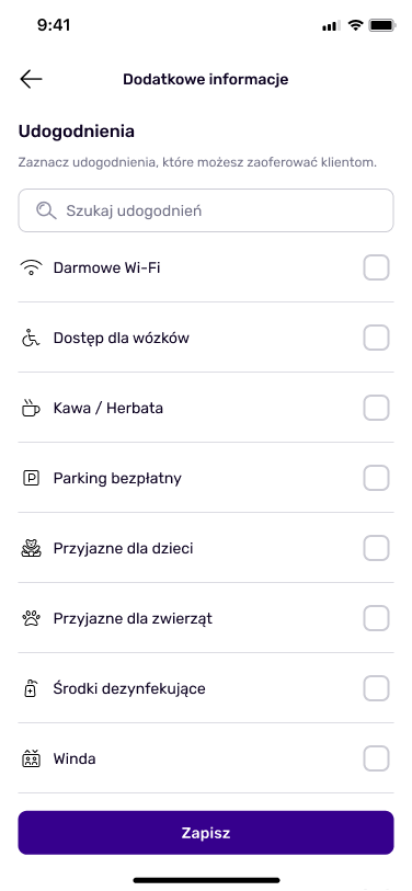
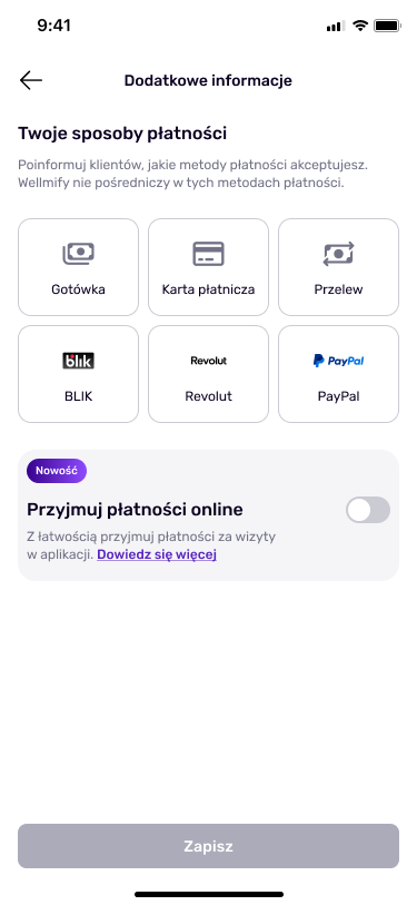
Selected screens with optional steps.
I introduced clearer CTAs to guide users through the onboarding process without confusion.
Original
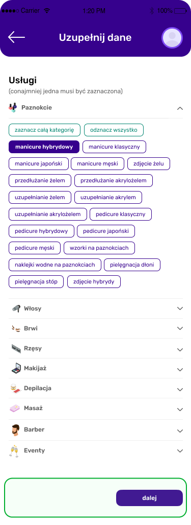
Improved
I created a prototype for the long version of the onboarding, tested it with users, and gathered feedback.
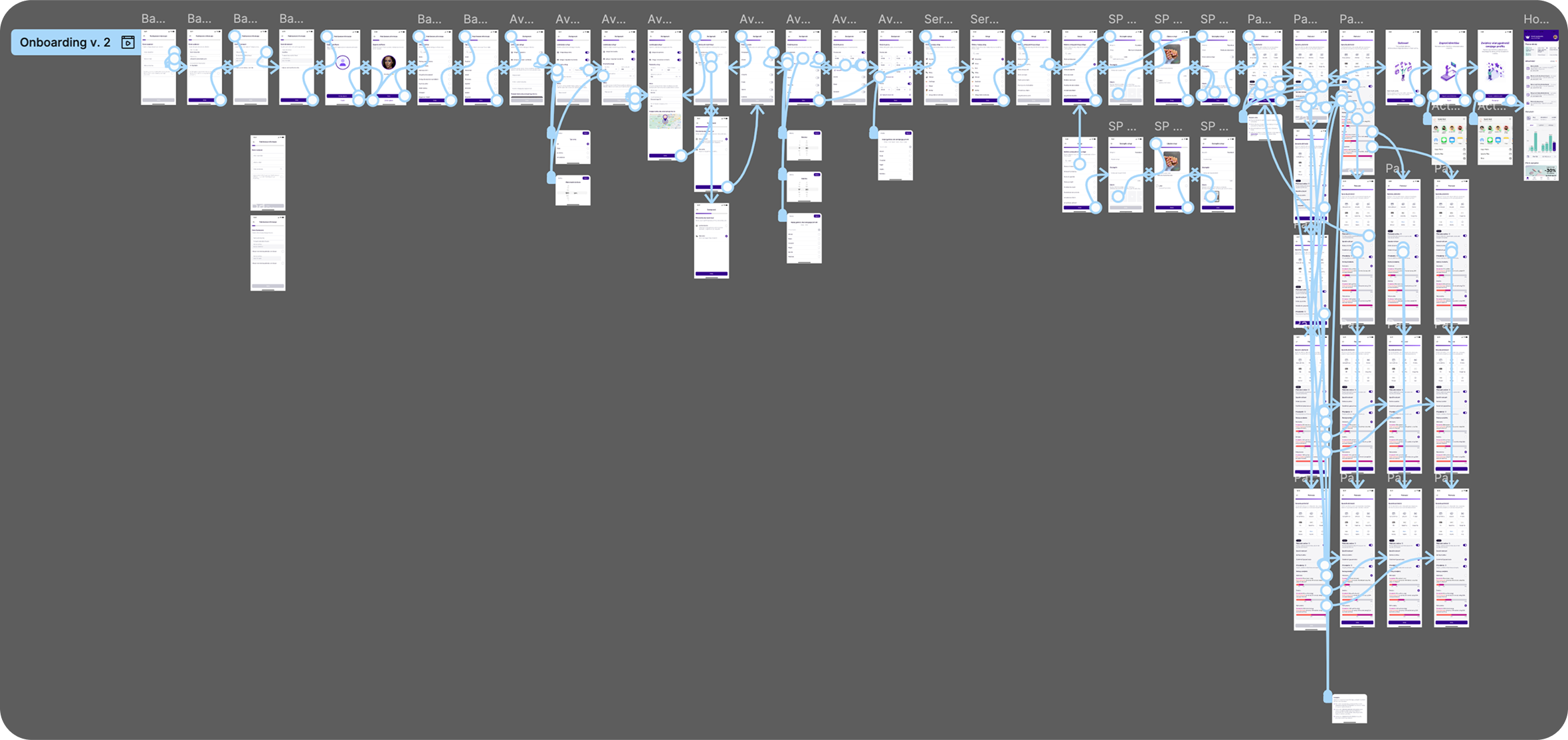
Prototype of initially improved onboarding.
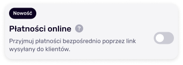
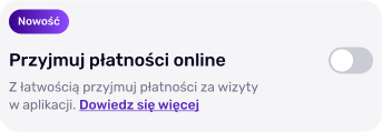
Based on user feedback, I made adjustments to improve clarity and flow, i.e. users didn't notice a tooltip, so I changed it to a more noticeable “Learn more” button.
Before tests
After tests
- Group A: Received the shorter version of onboarding.
- Group B: Received the longer version of onboarding.
- Key Metrics: We aimed for at least a 30 percentage points improvement in conversion.
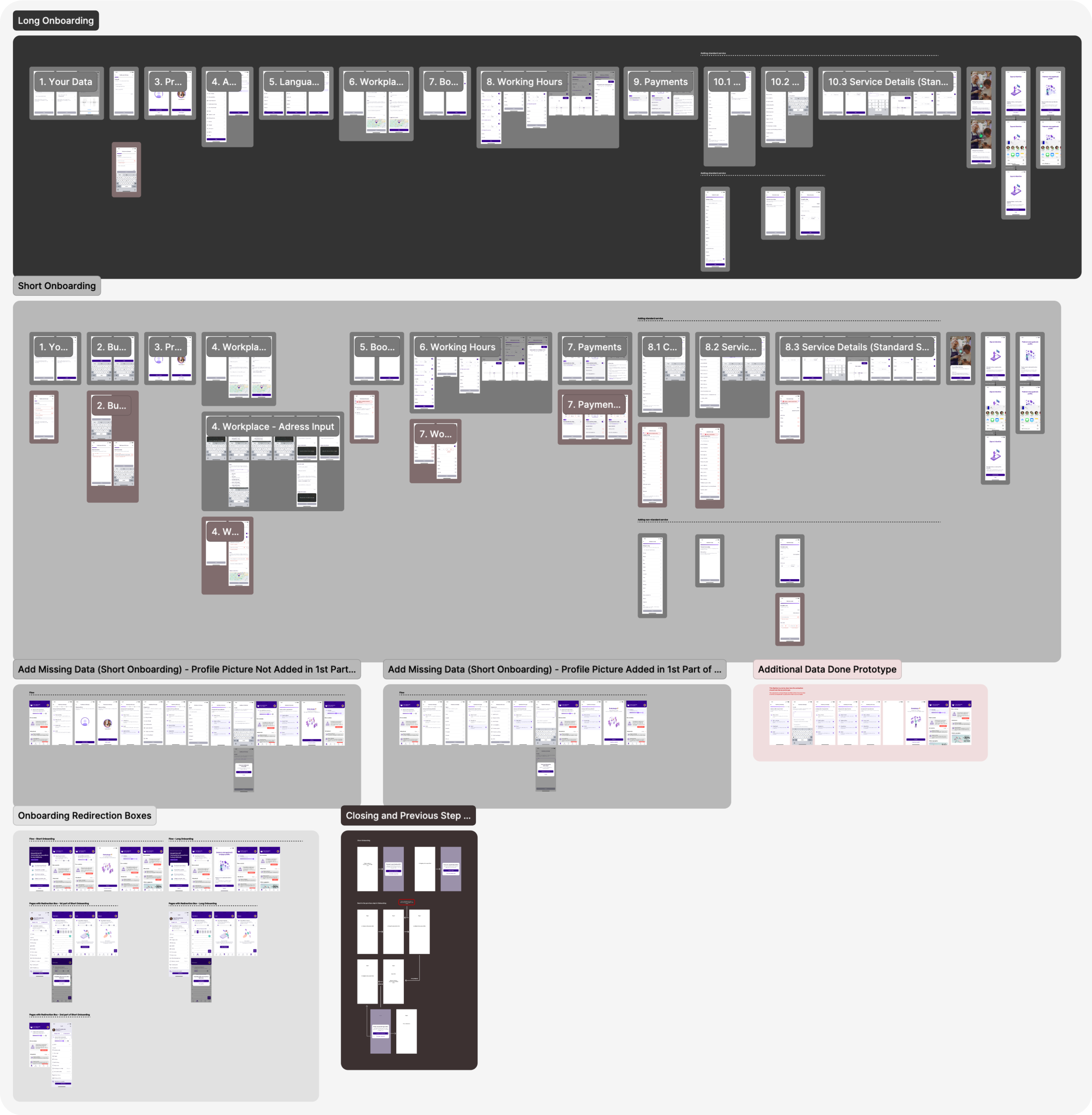
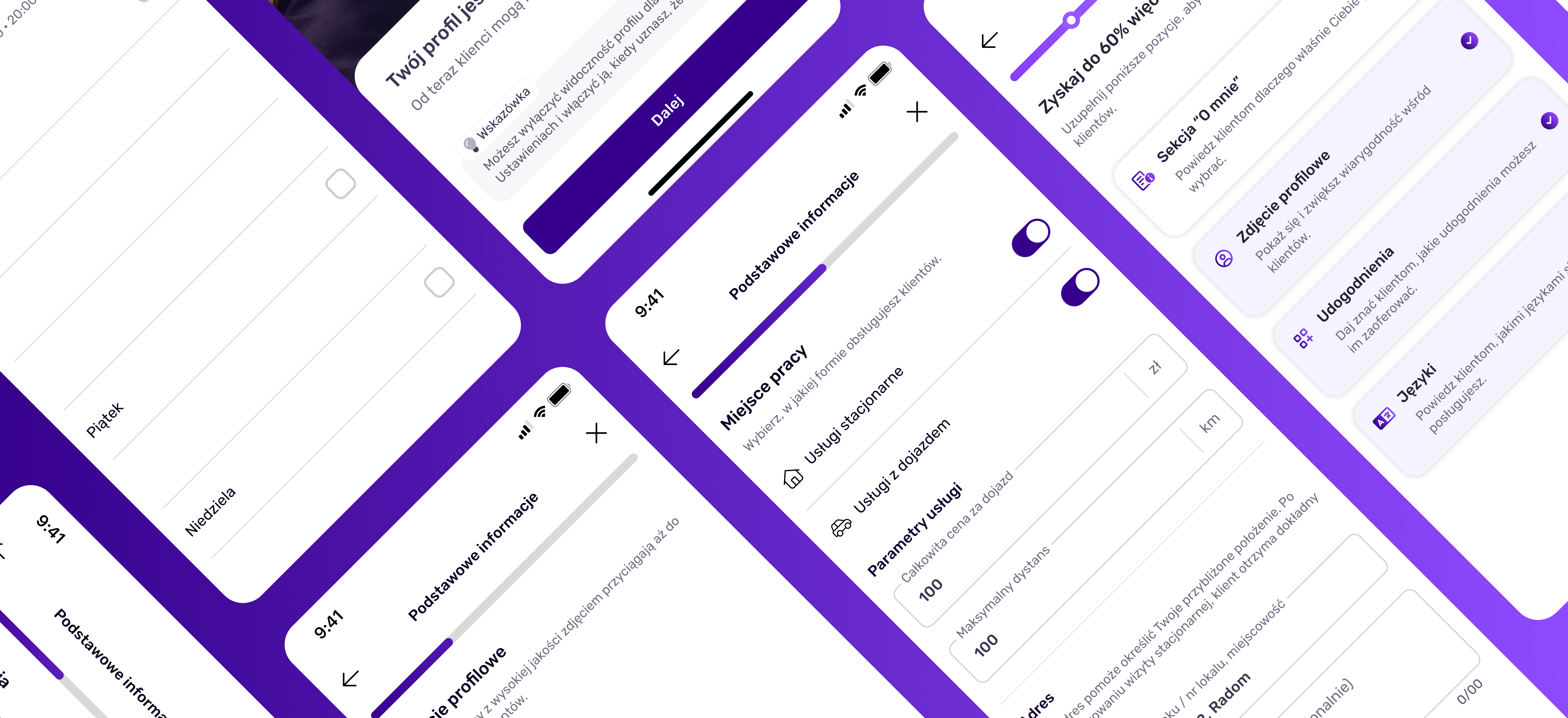
Final design of 2 onboarding versions.
- Conversion Rate:
- Version A (Shorter): Achieved the highest conversion rate, surpassing 66%.
- Version B (Longer): Also exceeded 66% but had a slightly lower conversion rate while leading to more complete profiles.
- Engagement: The shorter version (A) had higher post-onboarding engagement, mainly due to filling in the 2nd part of the onboarding. 82% of users completed the 2nd part of onboarding in the short version.
- Outcome: Basing on all the research, we decided to implement Version A of onboarding for all the users.
- A shorter onboarding led to a higher completion rate, which was crucial for engaging new users.
- Clear and concise UX writing and motivating design played a significant role in user engagement.
- Despite the longer onboarding providing more complete profiles, users appreciated the flexibility of completing additional steps later, leading to better engagement post-onboarding.
- We plan to further optimize the shorter onboarding based on user feedback.
- Additionally, we will conduct surveys and user interviews to identify new areas for improvement and refine the process through further A/B testing