My role
- UX/UI Designer
- Researcher
- UX Writer
Tools
- Figma
- Miro
- Google Forms
Purpose of the app
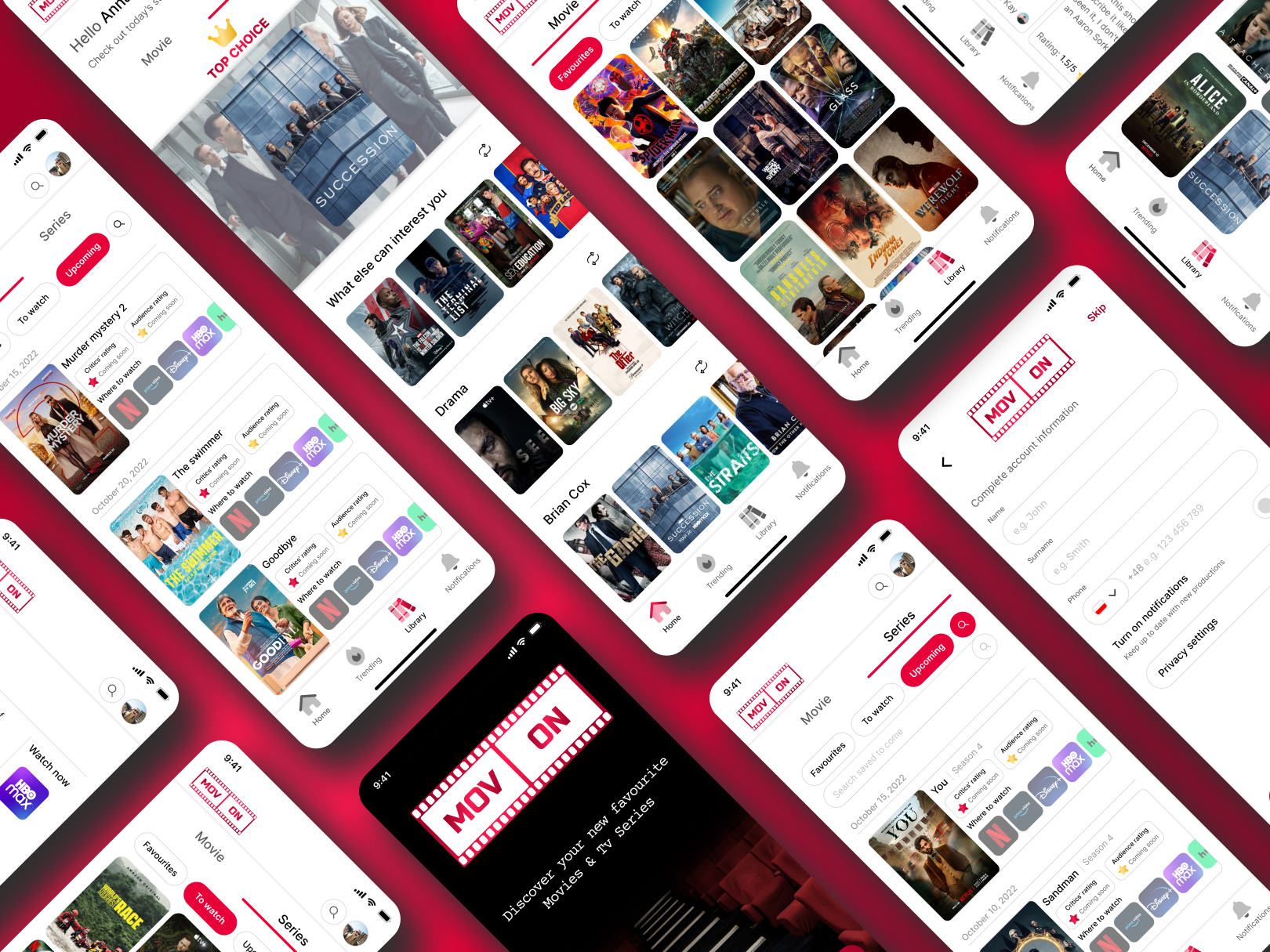
In a world that values simplicity, why complicate things with a series of apps when a large part of what we are looking for can harmoniously be found in one? This app is the solution to today's constant rush, embracing those who value their time and seek relaxation with a touch of sophistication.
Business goals
To delineate business objectives, I harnessed the power of the SMART model.
- Specific: Create a global platform featuring diverse films and series, and incorporates reviews from both critics and users.
- Measurable: Reach 500,000 users in the first year, mainly young and middle-aged.
- Achievable: Design a user-friendly interface for easy content discovery.
- Relevant: Implement personalized recommendations for higher engagement.
- Time-bound: Launch monthly"Critics' Choice" awards in the second year.
Problem
Data from a survey conducted by OnePoll on behalf of Plex from July 20 and July 27, 2022, with a panel of 2000 adults, shows that despite having 13 TV shows and 16 movies on average in their watch lists, 68% of Americans find it "nearly impossible" to get through them, with only 58% completing the list. Challenges include the list continually growing (43%), its length (29%), and the overwhelming nature (25%). Plex's study finds that organizing lists is essential, with 39% using notes or physical lists, while 40% rely on memory. With the average person subscribed to four streaming platforms, the struggle to decide what to watch takes around 30 minutes, prompting 65% to opt for something else and 56% to turn off the TV.
Solution
Addressing these challenges, the proposed solution involves designing an innovative application that streamlines the process. This app will possess the capability to seamlessly direct users to their chosen streaming platforms and aid in movie selection through insightful reviews and ratings from film critics, and users. Moreover, the application will include a personalized recommendation feature, utilizing user preferences and ratings to suggest productions that align with their interests. By amalgamating these features, the application aims to alleviate the overwhelming task of choosing what to watch and enhance the overall viewing experience.
Jump to the final prototype
Design process
1
Empathize
2
Define
3
Ideate
4
Prototype
5
Test
Market Research
Number of existing Movies and TV Series in the world, 2018-2022
According to IMDb, there is over a million productions in the world*. In the past 5 years the number of movies increased by 161 911 and TV series by 113 104. These are huge values and every year we will get more and more.
* Data as of June 2022
1 250 000
1 000 000
750 000
500 000
250 000
2018
2019
2020
2021
2022
Movies
Tv Series
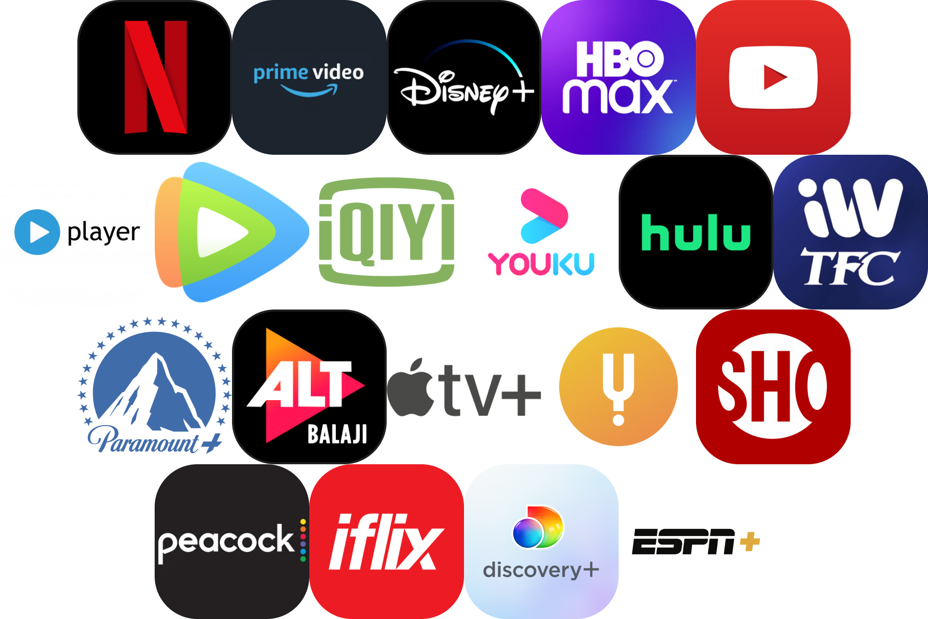
And what about the number of streaming services?
At the moment, there are as many as 60 streaming services in the world. Since 2020, 10 of them have arrived.
Competitive analysis
I have downloaded, analyzed and checked the functionalities of three mobile apps that partially solve the problem described above, but not entirely. Each lacks something to complement it. I have listed two advantages and disadvantages of each app to know what to avoid and what to include in my project. I also have read the comments from the users and picked some of them to focus on.
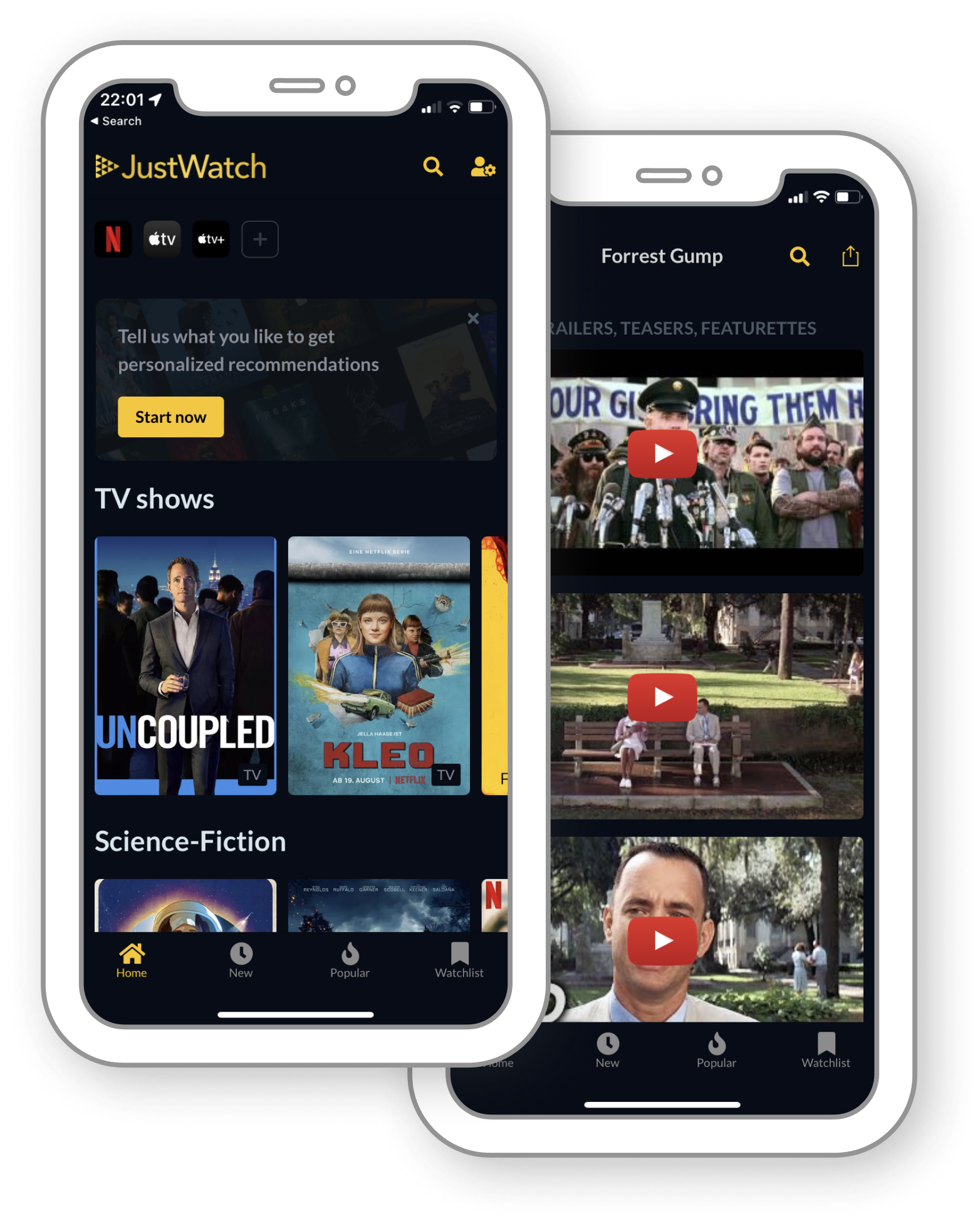

JustWatch
The ability to see which streaming service you can watch the production on.
Ratings, reviews and user discussions.
Landings look flat and ancient.
The streaming service you can use to watch the production is not always displayed correctly.
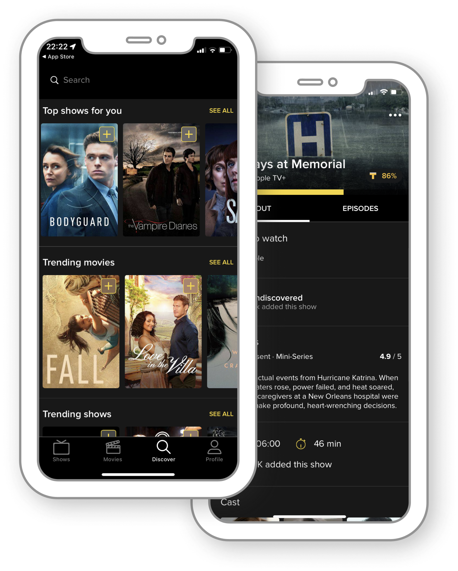

TV Time
The ability to see which streaming service you can watch the production on.
Ratings, reviews and user discussions.
Landings look flat and acient.
The streaming service you can use to watch the production is not always displayed correctly.
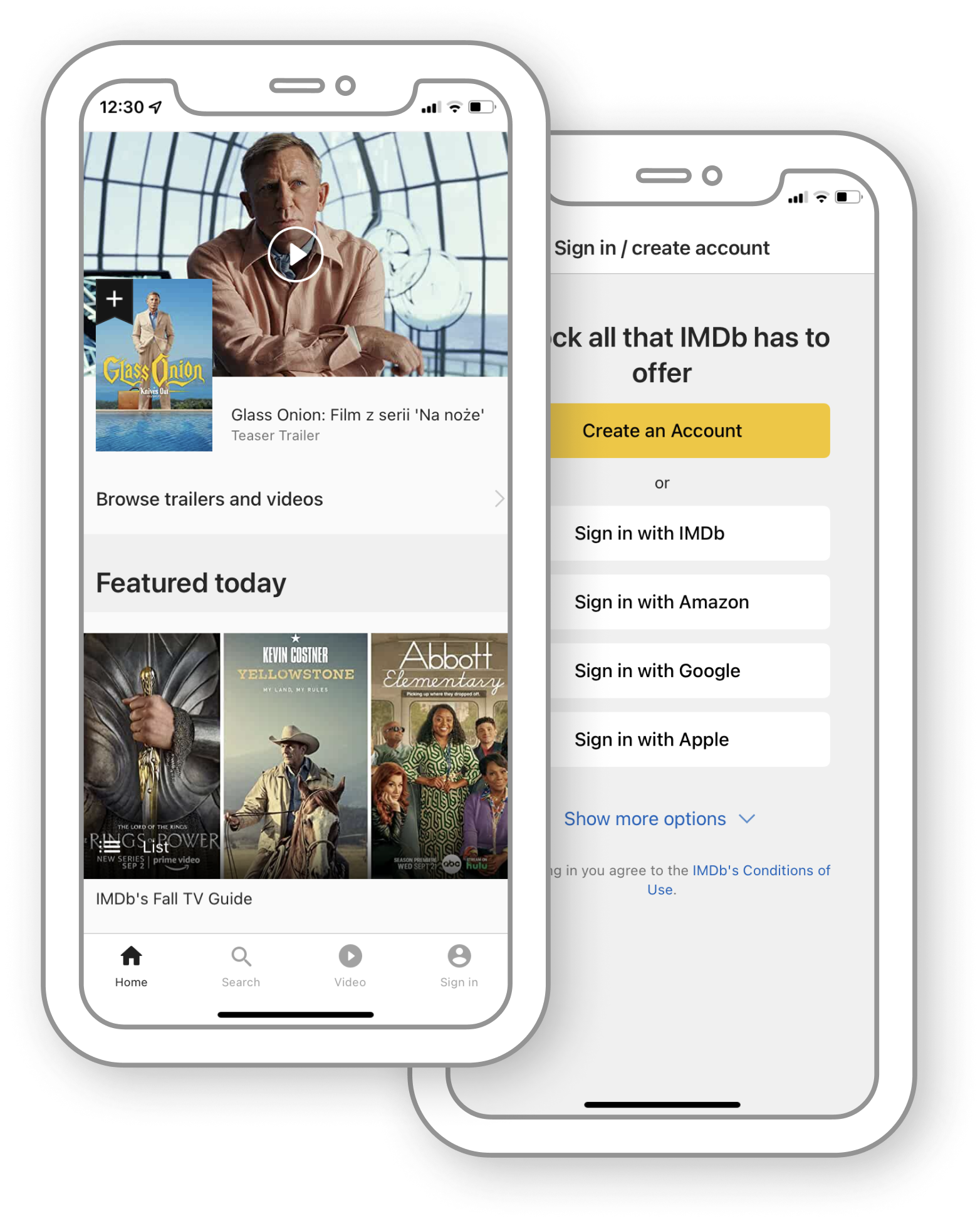

Imdb
Ratings from critics and users.
Suggestions for viewing on the homepage.
Lack of ability to see on which streaming platform the production can be viewed.
Too much information in one place, sometimes unscripted headings.
Comment section
I can’t log in. The only option is to create a new account.
Basia
App does not support most streaming services.
Caleb
There is no director in movie details. Why?
Gabi
User survey
In order to gain insights into the preferences and expectations of film fanatics, a succinct yet informative survey was conducted. This survey aimed to identify the features that users find valuable in mobile apps or websites dedicated to films and entertainment. The survey was administered to a total of 30 participants who met the criteria of being avid consumers of cinematic content, as they watch a minimum of three movies or TV show episodes each month. By collecting data from this diverse group of film enthusiasts, I was able to understand how individuals utilize such platforms and what they anticipate from the app currently under development. This section outlines the findings and analysis derived from this survey, shedding light on the key insights that will drive the design and development of the application.
1
Critics' ratings influence my choice.
61.9%
2
Ratings from other users influence my choice.
81%
3
I read critics' reviews.
52.4%
4
I read users’ reviews.
66.7%
5
I participate in discussions about movies/series.
9.5%
6
I read users' discussions about movies/series.
35%
7
I watch trailers before seeing the production.
85.7%
8
I watch more than one trailer before seeing the production.
14.3%
9
I use more than 2 streaming platforms.
90.5%
10
If the app recommends a production based on your preferences, I am willing to watch it.
90.5%
11
To the open question "What guides your choice of film/series?", people answered:
Title
Description
Recommendation
Genre
Ratings
Cast
Duration
12
To the open question "What you expect from the app?", people answered:
Organise
Ratings
User-friendliness
Accurate suggestion of films
Time
Notifications that a particular season of a series is already in full view
Reliability in evaluating series and films
Results of the survey
Respondents need an app that will help them select movies and series according to their preferences. They want to save time searching for a production that will satisfy them. There are many factors that determine the selection of the right movie for a person, and my job is to compose an interface that meets their needs.
Personas
Based on previous research, I created two personalities that will help me determine the target group for which the app is to be developed.
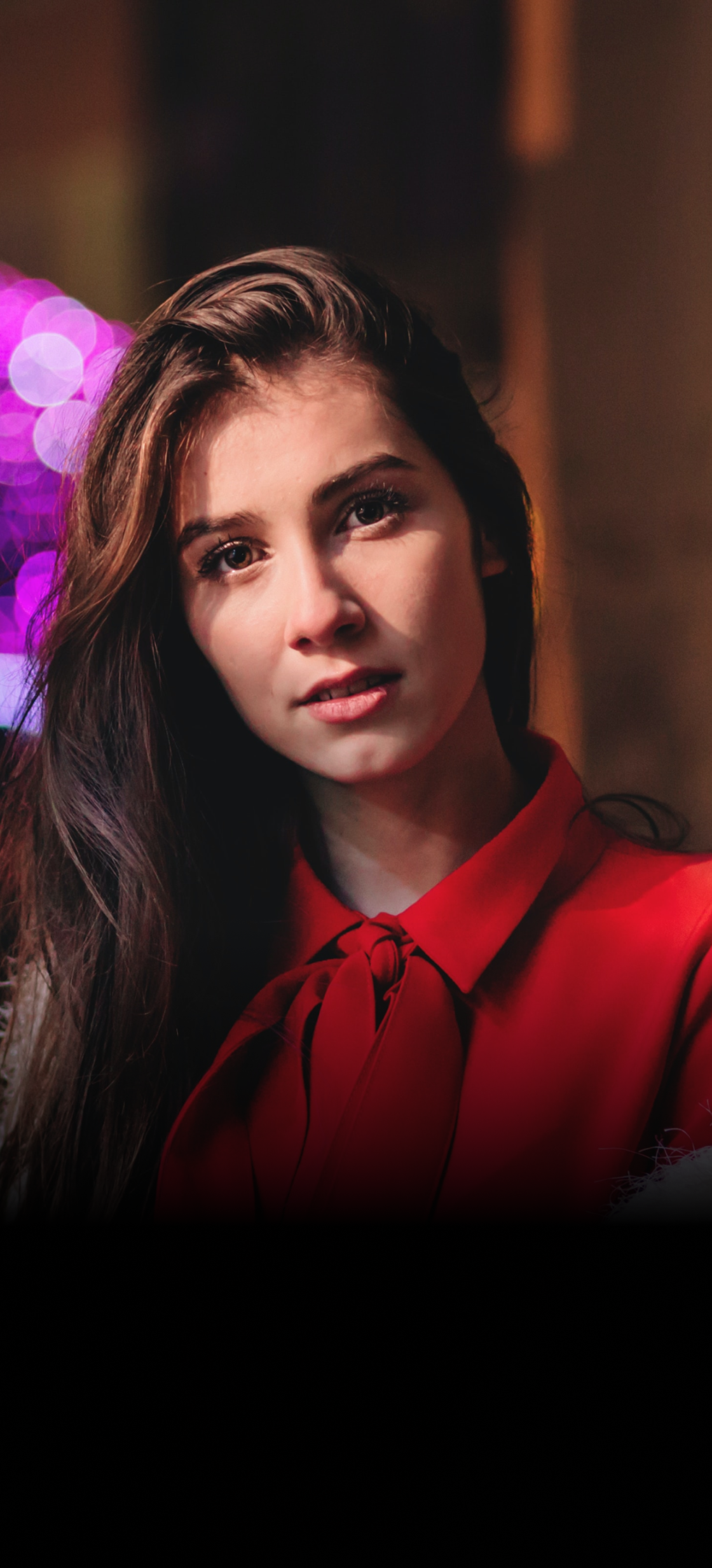
Anna Karmas
Age
Location
Marital status
Occupation
25
Warsaw
Single
iOS Developer
Background
Anna is an organized person with little free time during the day. Watching movies and TV series is her favorite leisure activity. It often happens that in the middle of a screening she finds that the movie is a total dud. She would like such situations not to happen again, and the films she takes to watching to be high-end.
Personality
Introvert
Extrovert
Analytical
Creative
Messy
Organized
Independent
Team player
Busy
Time rich
Pain-points
I waste my time watching bad movies.
I hate the fact that I have to search for series on 4 different streaming services.
I don’t like some of the actors
Goals
I’d like to:
watch good movies;
know the critics' recommendations;
be able to evaluate the production.
Pain-points
There is limited access to indie movies online.
I hate it when someone spoils me the content.
I don't get notifications that a production I'm interested in is already available to watch.
Goals
I’d like to:
review the movies, so the others can see;
know the cast of the film;
watch more foreign films.
Background
Liam is interested in cinematography. He enjoys evaluating and reviewing productions. For him, the most important thing in cinematography is the artistic aspect. Most of the films he watches are niche and little known, and he wants to show others that small directors can also create a real work of art.
Personality
Introvert
Extrovert
Analytical
Creative
Messy
Organised
Independent
Team player
Busy
Time rich

Liam Dubois
Age
Location
Marital status
Occupation
36
Paris
Single
Photographer
Storyboarding
I made up a sample story and presented it in storyboards to visually depict the potential path an app user could take. In order to ensure the relevance and effectiveness of these storyboards, I selected a character to be at the center of the narrative. Anna, the character I chose, serves as a reflection of the majority for whom the application is being developed. By embodying the traits, needs, and behaviors commonly exhibited by the target user base, Anna's journey through the app will offer valuable insights into the user experience and help shape the development process. This section delves into the key stages of Anna's interactive journey, as depicted through the thoughtfully crafted storyboards.
Persona: Anna Karmas
Scenario: Use the app to find and watch a good movie/series, then evaluate the production.
Big picture
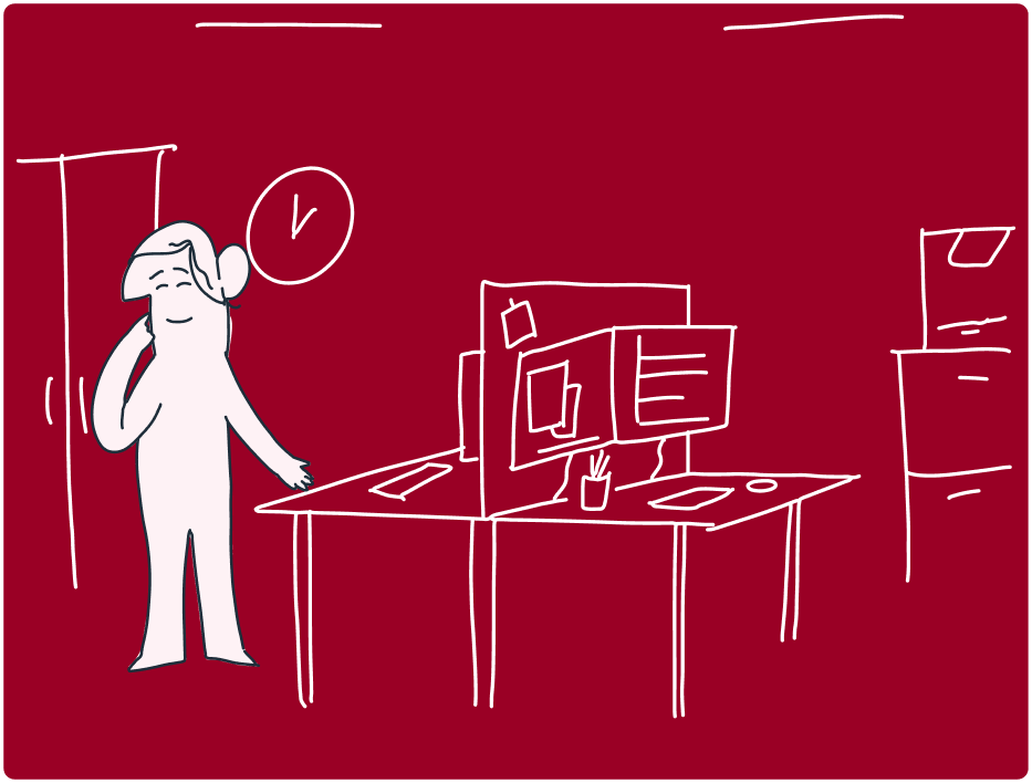
Anna has just finished her work and she dreams about watching some good movie to relax herself.
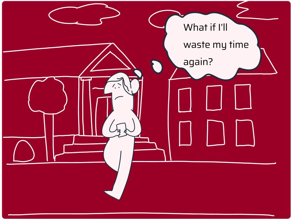
Anna is afraid that the movie she will pick will be failure again. So she starts to search for critics’ opinions.
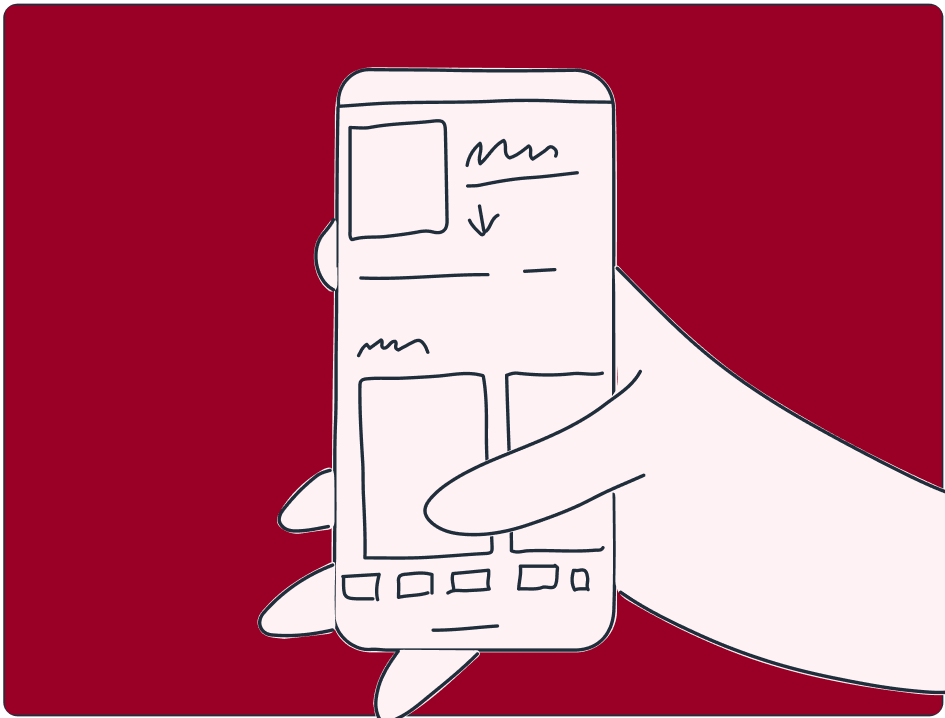
While on the critics’ forum, Anna sees an advertise about the app, that picks film for you and directs you to accurate streaming service.
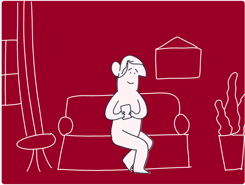
Once Anna gets home, she downloads the app, creates a new account and then chooses her preferences, and picks streaming platforms she uses.
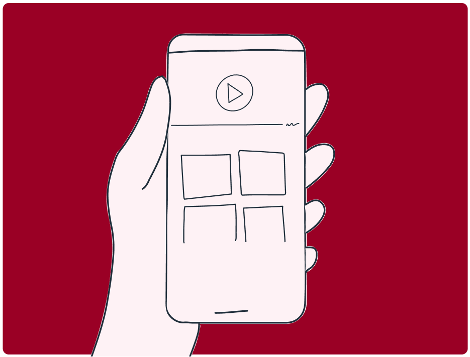
Movies and series tailored to Anna's preferences are ready for play.
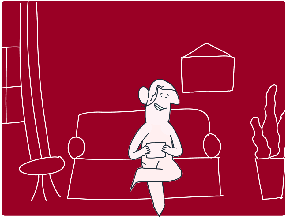
Anna watches the movie the algorithm picked for her and she enjoys it a lot
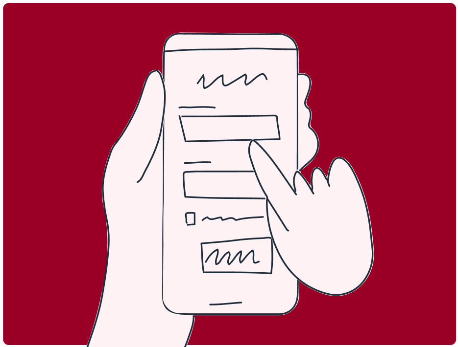
The movie ends, so Anna can rate and review it.
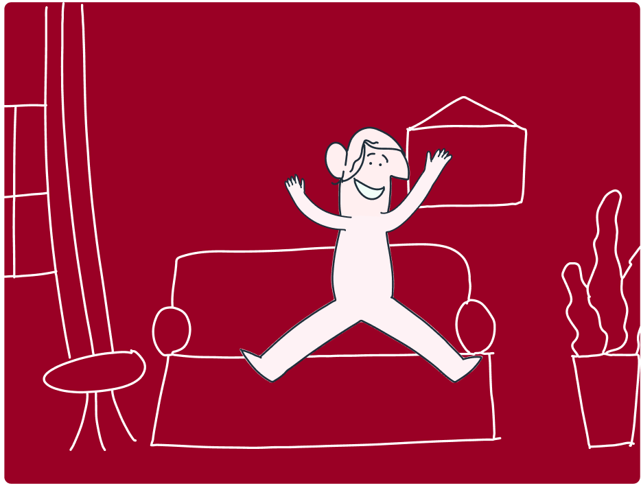
Anna is so happy that she will never again waste time on bad production.
Close-up
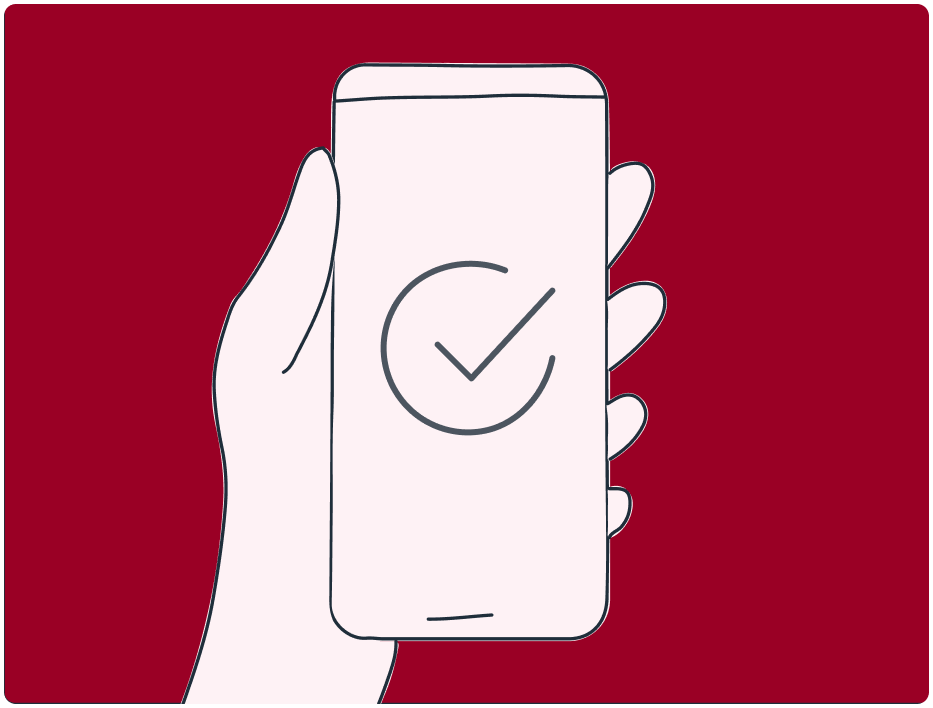
Anna downloads the app.
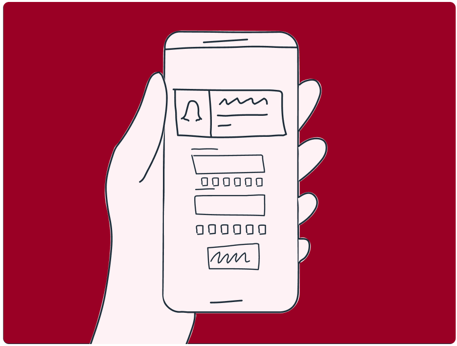
Anna creates a new account and chooses her preferences, favorite productions and actors.
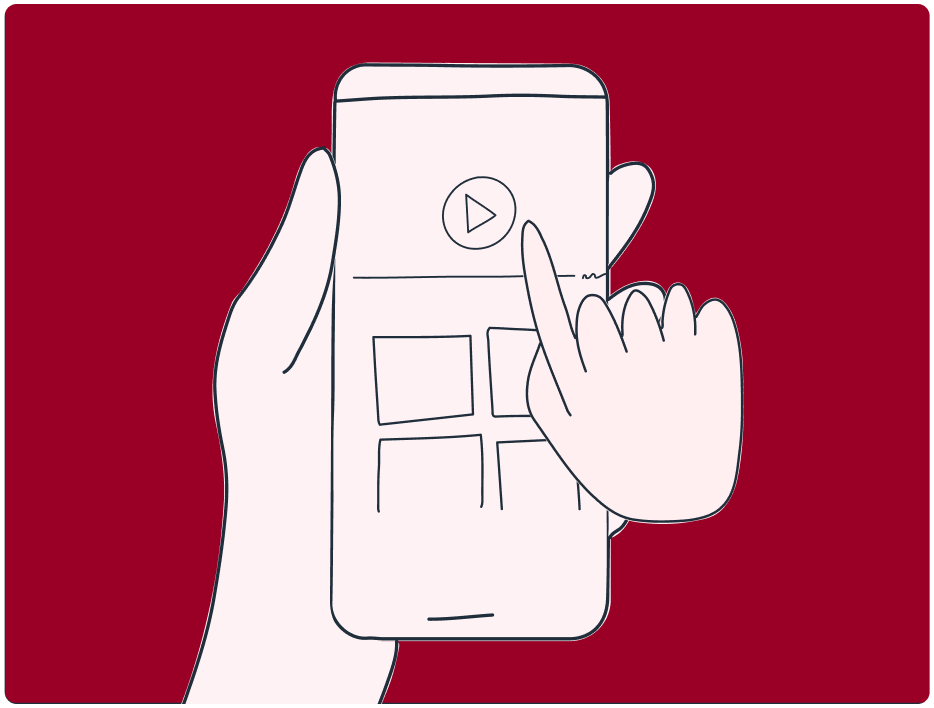
After confirming, the app selects the productions that are most common with Anna's preferences. Now all it takes is just one click to watch.
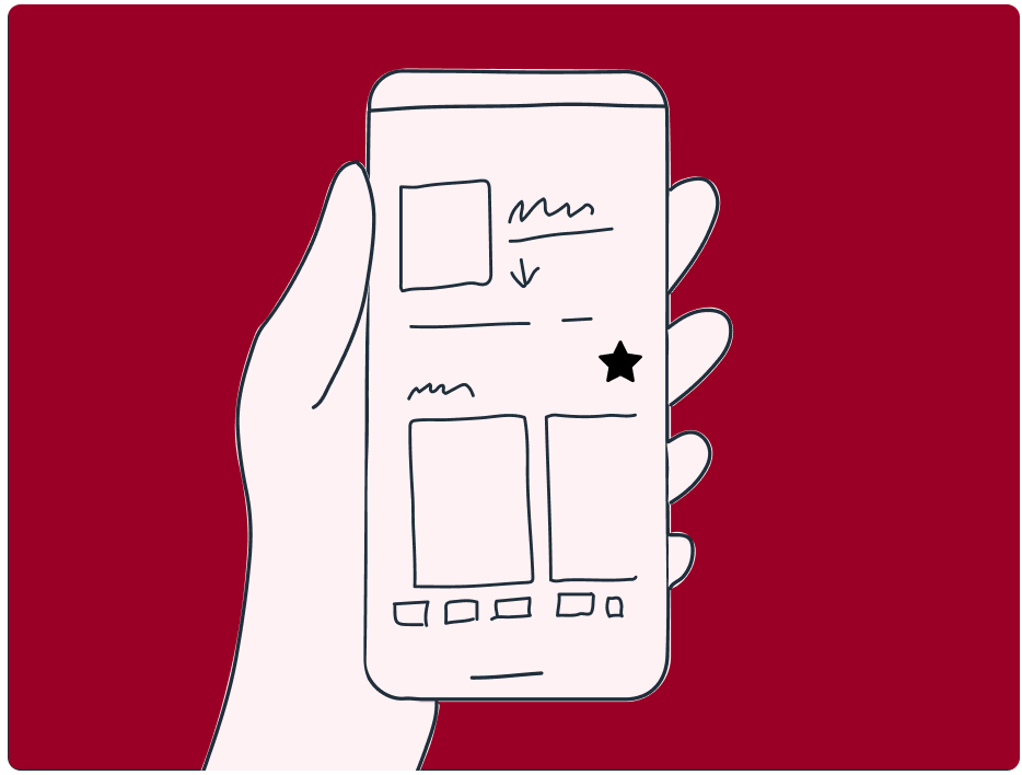
Before watching the production, Anna can read the details related to it and make sure she will like it. After watching she can rate and review it.
Storyboards were made using UX Storyboard Mix-&-Match Illustration Library by Lucian Popovici.
User journey map

Persona: Anna Karmas
Scenario: Use the app to find and watch a good movie/series, then evaluate the production.
Action
Searching for a movie
Searching for reviews
Looking for where to watch the film
Searching for a movie on a streaming service
To-do list
• Typing her preferences into the search engine.
• Visiting several websites.
• Searching for critics’ reviews and ratings.
• Searching for users’ reviews and ratings.
• Looking for a site that says where to watch a particular production.
• Searching for a movie on a particular streaming service.
Feelings
• Annoyed by having to type the same long phrases into the browser yet again.
• Irritated that she wastes so much time for that.
• Upset that once again she has to look for something, losing her precious time.
• Happy because she has already found a movie to watch.
• Eager that such a simple activity is taking so long.
• Pleased that this step is the last one and finally she can watch the movie.
Pain points
• Constant clicking between pages.
• Movies that she does not like appear.
• The need to visit at least two sites to read user and critic reviews.
• The site where you can find out where to watch a production has a lot of ads, making it impossible to navigate quickly
• The need to exit the browser and enter another application, which takes time.
• Entering the film's title once again throughout the process.
Solution
Creating an application that will help select a movie for the user based on one-time entered preferences.
Adding the ability to rate and review productions by both users and critics.
Enabling to mark which platforms person uses.
Adding a redirect to the video on a streaming service, where you can watch the production.

User flow
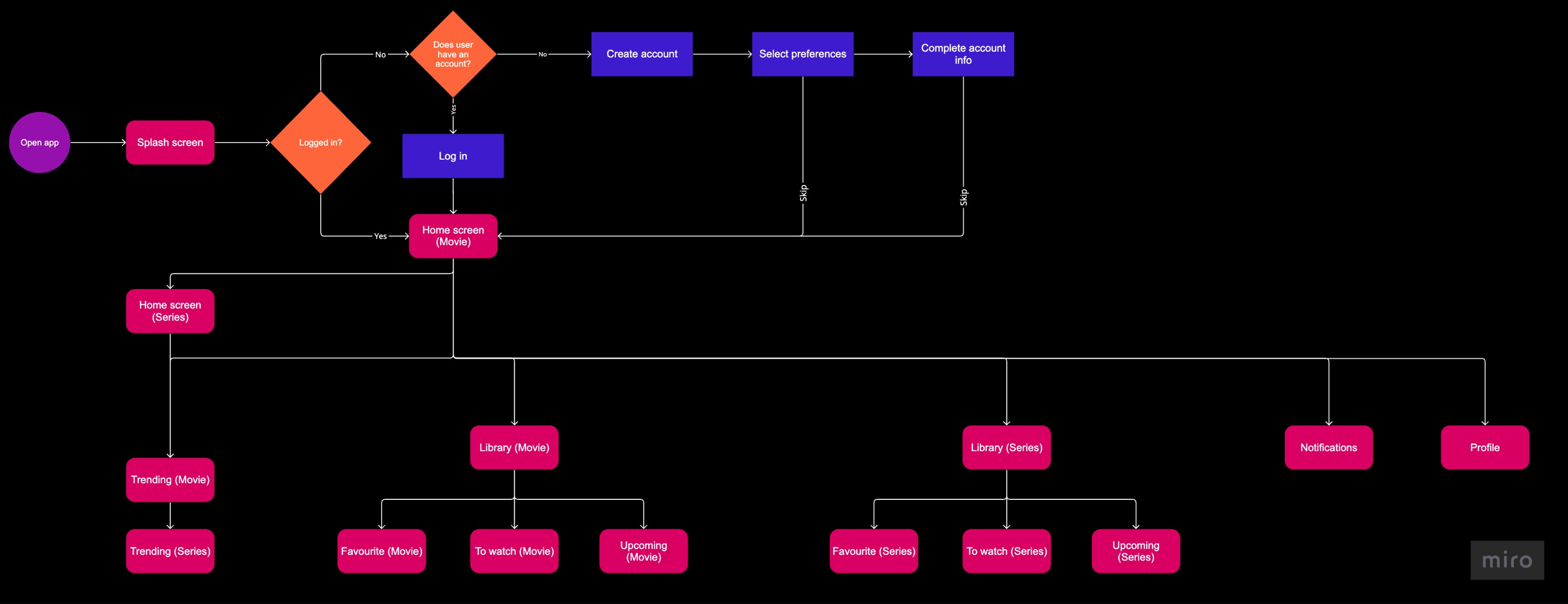
I prepared a basic user flow to show what different paths a user can take when using the app. The diagram helped me determine facts, such as what should go in the navbar or where I should place the profile icon.
Wireframes
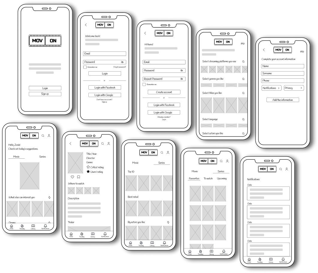
The previous step enabled me to start designing low fidelity wireframes to have a cursory look at the app. Firstly I drew them on paper, then transferred to digital form to make them clearer and more transparent. I decided to prepare prototypes for an iPhone 11 Pro Max user.
Usability tests - feedback
I asked 3 people to test an initial prototype of the app. While testing them, I watched their actions. Later I conducted a survey with them, took notes. Then I drew the following conclusions:
• users were fully aware of the app's purpose;
• the interface is friendly and understandable for each of them;
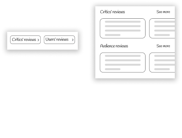
• I received a suggestion to change the reviews' display form to avoid another redundant click. I presented the change beside;
• 2 testers didn't like the phrase "Users' reviews/rating," so I changed it to "Audience reviews/rating," which they accepted.
Interactive lo-fi prototype
High-fidelity UI design
Now I can move on to creating high-fidelity screens. I started by choosing the colours for the design and the font. Initially the colours were going to be different, but I decided on red, which is associated with movie theater seats and curtain. I also created a colour that resembles light reflecting off a red surface, in order to give the impression that the app is a premium brand.
Colours
Primary
Brand Colour
HEX E80038
Dark 0.1
HEX D10032
Dark 0.2
HEX 9A0025
Light
HEX FEF2F5
Gradients
Primary 0.1
HEX A10128
HEX FD1E53
HEX A10128
Primary 0.2
HEX A10128
HEX FF154E
HEX A10128
Primary Dark
HEX 940226
HEX E51346
HEX 920225
Secondary
HEX 8B8B8B
HEX F6F6F6
HEX 8B8B8B
Secondary Dark
HEX 6B6B6B
HEX DEDEDE
HEX 6B6B6B
Golden
HEX FFB800
HEX FFE193
HEX E9AE14
Shades Of Grey
20
HEX 5C5C5C
40
HEX 9A9A9A
60
HEX C2C2C2
80
HEX D7D7D7
90
HEX EBEBEB
100
HEX FAFAFA
Essential Colours
White
HEX FFFFFF
Black
HEX 000000
Additional Colours
Positive
HEX 00A611
Negative
HEX CC0000
Typography
Inter
AaBbCc
H01 Medium
AaBbCc
H02 Regular
AaBbCc
H02 Medium
AaBbCc
H02 ExtraBold
AaBbCc
H03 Regular
AaBbCc
H03 Medium
AaBbCc
H03 ExtraBold
AaBbCc
H04 Regular
AaBbCc
H04 Medium
AaBbCc
H05 Regular
AaBbCc
H05 Medium
AaBbCc
H06 Regular
AaBbCc
H06 Medium
Alignment and grid
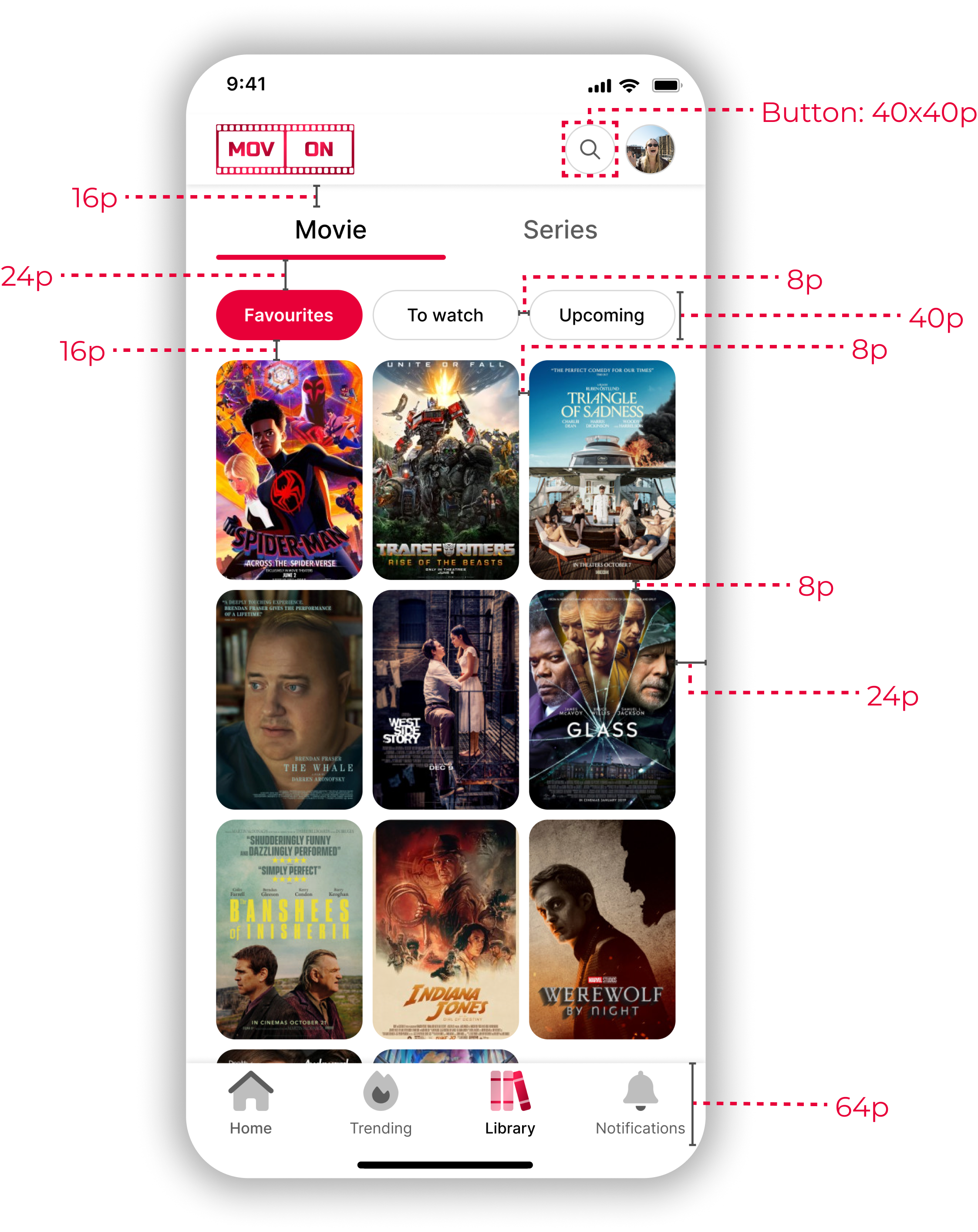
In the project I used a 8-point grid and columns with 8-point gutter. The app has gaps of 8, 16 and 24 points. Differences in spacing size are due to the visual impression between texts and images. The margin is 24 points.
I used Auto layout and Constraints options while creating components.
Prototype
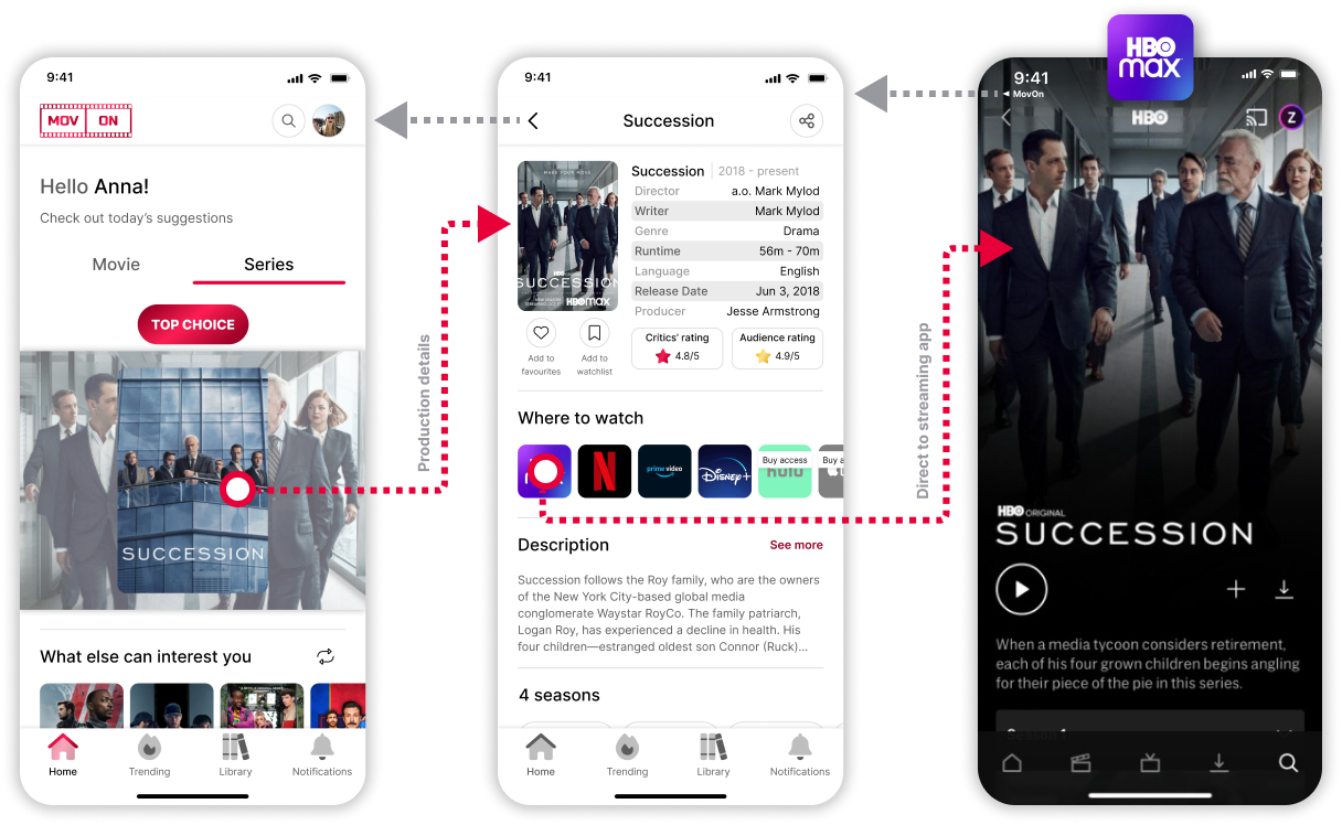
I have created 28 screens that users can navigate between using the bottom navigation bar and the search icon. This allows users to reach any screen within a maximum of two steps.
Interactive hi-fi prototype
Usability study
Prototype validation
I asked 8 people to test the prototype through Figma and FigJam app. Beforehand, I created a list of questions I want to know the answers to. I met with each tester in-person, so I was getting feedback on a regular basis. I also wrote scripts that testers relied on. UI tests were consisted of verifying that each user would know how to navigate the application. The tasks consisted of commands such as: check the critics' ratings of the movie of the day; check where to watch a recently liked movie; check when a TV series you are waiting for comes out; find a TV series with one of your favorite actors and many more.
Results
After testing the app, I gave each test participant a questionnaire to fill out, which showed that the application is fully clear and there are no problems in navigating through it. However, there werethree comments about inconveniences that I decided to fix:
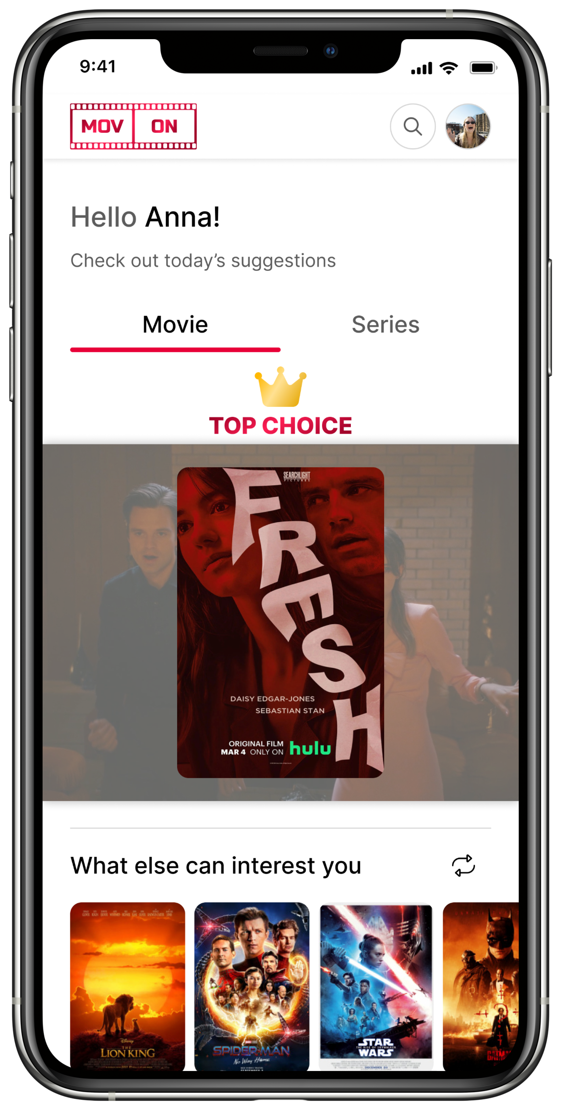
• The writing on the home page "TOP CHOICE" resembles a button, so I decided to remove the background along with the rounding that suggested it and created a new component in which I used two gradient colors, shown earlier in the project.
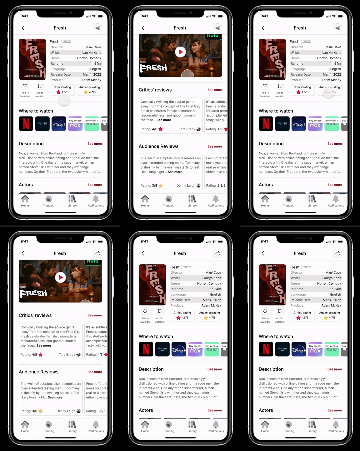
• I added scrolling to the reviews section on the screen after pressing the "Critics' rating"and "Audience rating" buttons, .
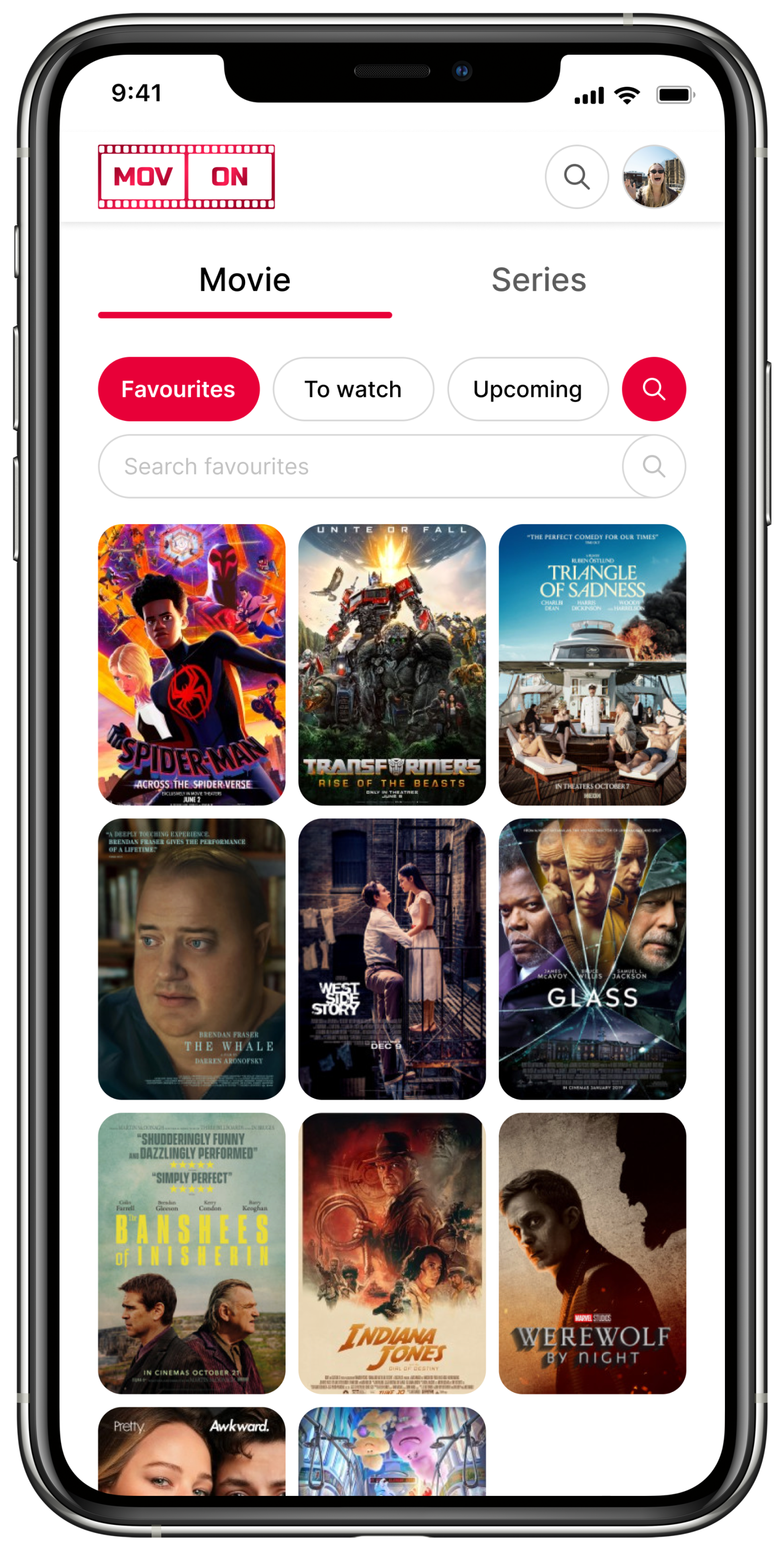
• I created a search bar on the “Favourites”, “To watch” and “Upcoming” screens, both for movies and series.
Final interactive hi-fi prototype
Project summary
This is my first case study, so I learned a lot of essential skills for a UX/UI designer while working on the app. I got acquainted with many plugins that I will definitely use in the future. During the project I was dealing with things such as market research, creating surveys for potential users, forming personas, making storyboards and user journey maps. What I enjoyed the most was interviewing testers, who gave me a lot of food for thought and thanks to them I was able to improve the application. For this project I spent a lot of time in days and nights, but creating a project like this is incredibly rewarding so I appreciate it very much.
